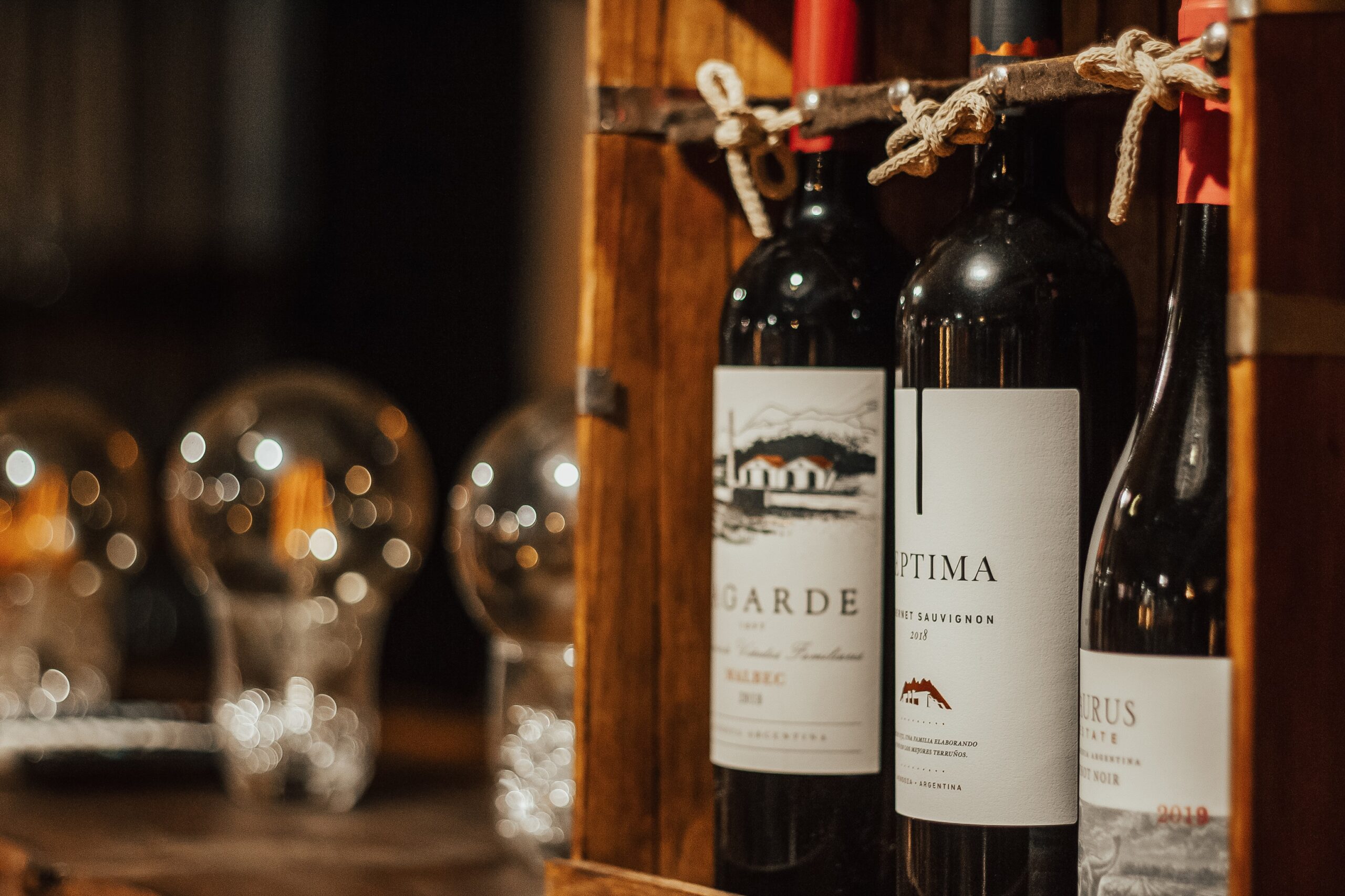
The label of your wine bottle is one of the most important aspects of your winery’s branding. It is the first thing potential customers will see when looking at your product, so you want to ensure it’s attractive and eye-catching. If you’re having trouble coming up with a design for your wine labels, here are eight tips to help you enhance your winery’s branding.
Tip 1: Use Quality Materials
If you want to make a splash in the industry, use quality materials and tastefully display them. The quality of the materials used to make your label can significantly impact how it looks and feels. Make sure you invest in high-quality paper or cardstock that won’t tear or smudge easily and durable ink that won’t fade over time. This will ensure that your label looks sharp and professional for years to come. A good-quality label printing in Australia can be the difference between someone buying your wine and not.
Tip 2: Focus on Typography
When designing your winery brand’s label, one of the essential elements is typography! Choose fonts and colours that are easy to read and represent your brand well. Be sure to consider the font size, too – if it’s too small or too large, it won’t be legible from a distance. If possible, test out different font combinations on various surfaces before deciding which works best for your wine label design.
Tip 3: Consider Color Psychology
Colour plays an important role in people’s perception of a product or brand, so be careful when selecting colours for your wine labels. Do some research into colour psychology and use this knowledge to guide your decisions. Warm colours such as red and orange evoke excitement and energy, while cooler tones like blue can be calming and soothing. The colour psychology behind your brand design will dictate whether or not certain colours work well together on your label design. Choose a few colours representing your brand and use them consistently across all your labels.
Tip 4: Be Mindful of Balance
Balance is key when designing a label – no element should be overpowering or distracting from other parts of the design. Make sure all elements are proportional in size and evenly spaced out on the label so they work together harmoniously without any one part dominating the rest. Keep in mind that less is more when creating visually appealing labels! Develop a consistent layout for your labels that includes elements such as the location of your logo, the type and placement of text, and the overall design layout. This helps to create a cohesive brand image and makes it easier for customers to recognise your wine.
Tip 5: IncludeYour Logo
Your logo should be prominently featured on the front of each wine label. This will help customers recognise your brand quickly and easily whenever they spot a bottle with one of your designs on it. Depending on where you plan to sell your wines, there may also be regulations regarding how much logo space you’re allowed to use – make sure you check these before designing anything!
Tip 6: Don’t Forget to Include Necessary Information
In addition to graphic elements related to branding, don’t forget to include any necessary information about the wine itself. If your winery is located in a specific region or has a unique history, consider incorporating elements of that location or history into your label design. You’ll also need to include warning labels if required by law – these should be clearly visible but not overpower other elements in the design. This can help to create a sense of place and give customers a deeper understanding of your wine. But don’t overcrowd your label with too much information; a clean, simple design is often more effective and easier for customers to read and understand.
Tip 7: Use Appropriate Imagery
Choose imagery that is appropriate for your brand and the type of wine you are producing. For example, if you are producing a luxury wine, you may want to use more elegant, sophisticated imagery. On the other hand, if you are producing a more casual, everyday wine, you may want to use more approachable, down-to-earth imagery.
Tip 8: Test Before Printing
Once you’ve finished designing your labels, make sure you test them out first before committing them to print! Print out samples in various sizes so you can get an idea of how they look in person – this way, if there’s something wrong with the design or layout, you can fix it before wasting money printing hundreds (or thousands!) of labels with mistakes on them!
Final Words
Developing a great-looking label for your winery’s products can be challenging – but with these eight tips in mind, it can certainly be done! With careful consideration, you’re sure to create an eye-catching label that will enhance existing customers’ experience with your wines and attract new ones!
Use your label to tell a story about your winery, the wine, or the region where it is produced. This can help to create a stronger connection with your customers and differentiate your wine from others on the market. Special finishes, such as foil stamping or embossing, can add a premium touch to your labels. Just be sure to use them sparingly and in a way that enhances, rather than detracts from, the overall design.
So don’t delay – get started today on creating beautiful labels with DAL, a wine label printing company in Australia, for all those delicious bottles waiting for their turn!