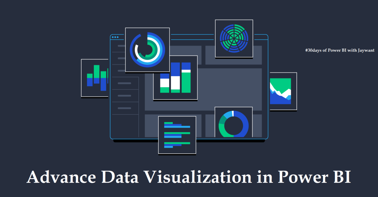
Power BI is a popular business intelligence and data visualization tool. In this Power Bi Training, we will explore some of the advanced visualization options available in Power BI that can take your reports and dashboards to the next level. Whether you want to showcase data in creative new ways or add interactivity to engage your audience, Power BI offers many possibilities. We will look at options like custom visuals, R-powered visuals, and techniques for adding advanced analytics. By the end, you will have new skills to build rich, interactive reports that tell impactful data stories.
Introduction to Advanced Visualization in Power BI
In today’s data-driven world, the ability to visualize data effectively is crucial for making informed decisions. Microsoft Power BI is a powerful business intelligence tool that enables users to create interactive and insightful visualizations from their data. While Power BI offers a range of standard visualization options, there are advanced features and techniques that can take your data visualizations to the next level.
This blog post will explore the various advanced visualization options available in Power BI, from custom visuals and advanced chart types to geographic and time-based visualizations, interactive features, AI integration, advanced formatting options, and more. By leveraging these advanced visualization capabilities, users can unlock deeper insights, enhance data storytelling, and drive better decision-making within their organizations.
Custom Visuals: Enhancing Visualizations Beyond Standard Options
One of the key features that sets Power BI apart is its support for custom visuals. These visuals extend beyond the standard options provided by Power BI, allowing users to create unique and tailored visualizations that meet their specific needs. With custom visuals, users can enhance the aesthetics and functionality of their reports, making them more engaging and informative.
Custom visuals can be created using Power BI’s developer tools or downloaded from the Microsoft AppSource marketplace. From advanced charts and graphs to specialized visualizations like heat maps and network diagrams, the possibilities are endless. By leveraging custom visuals, users can add a personal touch to their reports and showcase data in a way that resonates with their audience.
Advanced Chart Types: Utilizing Hierarchical and Statistical Visualizations
Power BI offers a wide range of chart types to help users visualize their data effectively. From basic bar charts and line graphs to more advanced options like treemaps, box plots, and waterfall charts, users can choose the right chart type to convey their data insights accurately. Hierarchical visualizations like sunburst charts and drill-down capabilities enable users to explore data at different levels of granularity, providing a comprehensive view of their data.
Statistical visualizations such as histograms, scatter plots, and trend lines allow users to analyze relationships and patterns within their data. By leveraging advanced chart types, users can uncover hidden trends, outliers, and correlations that may not be apparent in traditional charts, enabling more informed decision-making and data-driven insights.
Geographic and Time-Based Visualizations: Mapping and Timeline Features
Geographic and time-based visualizations are powerful tools for analyzing spatial and temporal data in Power BI. With built-in mapping capabilities, users can create interactive maps that visualize data geographically, enabling them to identify trends, patterns, and outliers based on location. Time-based visualizations like timelines and date slicers allow users to analyze data over time, track historical trends, and forecast future outcomes.
By combining geographic and time-based visualizations, users can gain a deeper understanding of their data and uncover insights that may be hidden in traditional charts and tables. Whether visualizing sales performance across regions or tracking project milestones over time, these features enable users to tell compelling data stories and drive actionable insights.
Interactive Features: Drill-Through and Report Bookmarking
Interactivity is a key aspect of effective data visualization, allowing users to explore data dynamically and drill down into specific details. Power BI offers interactive features like drill-through and report bookmarking, which enable users to navigate through their data, view related information, and save specific views for future reference.
Drill-through functionality allows users to click on data points in a visualization to see detailed information related to that data point. Report bookmarking enables users to save specific states of a report, including filters, slicers, and visualizations, making it easier to revisit and share specific insights with others. By leveraging these interactive features, users can engage with their data more effectively and extract meaningful insights from their reports.
Data Insights with AI: Integrating Machine Learning into Visualizations
Artificial intelligence (AI) and machine learning (ML) are revolutionizing the field of data analytics, enabling users to uncover insights and patterns in their data that may not be apparent through traditional analysis methods. Power BI offers built-in AI capabilities that allow users to integrate machine learning models directly into their visualizations, enabling them to predict outcomes, identify trends, and make data-driven decisions.
By leveraging AI-powered features like forecasting, clustering, and anomaly detection, users can gain deeper insights into their data and make more accurate predictions about future outcomes. Integrating AI into visualizations not only enhances the analytical capabilities of Power BI but also enables users to unlock new opportunities for data exploration and discovery.
Advanced Formatting Options: Themes, Templates, and Customization
In addition to advanced visualization features, Power BI offers a range of formatting options that allow users to customize the look and feel of their reports. Themes enable users to apply consistent styling across their reports, ensuring a cohesive and professional appearance. Templates provide pre-designed layouts and visualizations that users can leverage to create visually appealing reports quickly.
Customization options like conditional formatting, data labels, and tooltips allow users to tailor their visualizations to meet specific requirements and highlight key insights. By leveraging advanced formatting options, users can create reports that are not only informative and insightful but also visually appealing and engaging to their audience.
Integrating R and Python Visuals: Extending Power BI’s Visualization Capabilities
For users with advanced analytical requirements, Power BI offers the ability to integrate R and Python scripts directly into their visualizations. By leveraging the computational power of R and Python, users can create custom visualizations, perform complex data transformations, and implement advanced statistical analysis techniques within Power BI.
R and Python visuals enable users to harness the capabilities of these programming languages to create interactive and dynamic visualizations that go beyond the standard options available in Power BI. Whether performing sentiment analysis on text data or building predictive models, integrating R and Python visuals extends the visualization capabilities of Power BI and empowers users to tackle complex analytical challenges with ease.
Best Practices for Advanced Visualizations
When creating advanced visualizations in Power BI, it is important to follow best practices to ensure that your reports are informative, engaging, and easy to understand. Some key best practices to keep in mind include:
- Understand Your Audience: Tailor your visualizations to the needs and preferences of your audience to ensure that they resonate with the intended viewers.
- Simplify Complex Data: Use clear and concise visualizations to communicate complex data insights effectively and avoid overwhelming your audience with unnecessary details.
- Maintain Consistency: Apply consistent formatting, colors, and styles across your reports to create a cohesive and professional appearance.
- Use Interactivity Wisely: Leverage interactive features like drill-through and report bookmarking to engage users and enable them to explore data dynamically.
- Test and Iterate: Continuously test and iterate on your visualizations to identify areas for improvement and refine your reports for maximum impact.
By following these best practices, users can create advanced visualizations in Power BI that drive actionable insights, enhance data storytelling, and empower decision-makers within their organizations.
Conclusion
In conclusion, exploring advanced visualization options in Power BI opens up a world of possibilities for users to create interactive, insightful, and visually appealing reports from their data. From custom visuals and advanced chart types to geographic and time-based visualizations, interactive features, AI integration, and more, Power BI offers a comprehensive suite of tools and features to help users unlock deeper insights and drive better decision-making.
By leveraging the advanced visualization capabilities of Power BI and following best practices for creating effective visualizations, users can transform their data into compelling stories that inform, inspire, and drive action. Whether analyzing sales performance, tracking key performance indicators, or predicting future trends, Power BI empowers users to explore data in new and innovative ways, enabling them to extract meaningful insights and make informed decisions.