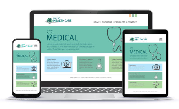
Choosing an appropriate image for your healthcare website is an important aspect. An ideal image would involve a patient and a staff member interacting. You can edit images with a tool like Canva and use them as banners for your website. In addition to images, you can use microinteractions to keep your visitors interested. Some of these interactions include animated chat bubbles.
Human factors
Human factors is a scientific discipline that seeks to improve the performance of people and systems. Its goal is to reduce errors and increase resilience. The goal is to make it easy for people to do the right thing and difficult to make a mistake, thereby reducing the risk of harm to patients.
The practice of human factors involves incorporating aspects from various domains to design products, services, and environments. Human factors can include ergonomics, usability, and learnability, and is often referred to as HCI.
Responsive design
Responsive healthcare website design is a key element in ensuring that your website is visible to the largest number of people. This design adjusts to the viewer’s device, making images and text more easily readable. It is also very important to ensure that your website is optimized for the speed of mobile devices, as speed alone won’t compensate for poor user experiences.
One of the most important factors in a responsive healthcare website is the form design. Forms should be easy to fill out and have simple, yet secure navigation. A page with too many items in the navigation menu may appear chaotic and confusing to visitors. Moreover, forms should avoid avant-garde designs or eccentric page structures. In addition, the page should have plenty of white space, funneling visitors’ attention to the most relevant information.
Microinteractions
Microinteractions are small elements of design that make users feel appreciated and important. They are an excellent way to satisfy the human need for acknowledgment and satisfaction. They are also beneficial from a business perspective. Microinteractions are an excellent way to ensure the success of your website and increase user satisfaction.
Microinteractions should be designed so that users feel natural when using them. They should be relevant to the target user’s needs and choices, and should be crafted for long-term use. Users’ emotions play a huge role in their interactions, and should be designed accordingly.
Site taxonomy
Site taxonomy can be an effective way to improve your website design and help users find information they are interested in. It can help make a healthcare website more navigable, too. Site taxonomies can be used to organize topics and pages, such as types of procedures and treatment options. For example, you might use a taxonomy for dental procedures, with terms for procedures like wisdom teeth extraction, jaw surgery, bone grafting, and pre-prosthetic surgery.
Creating a taxonomy is also a great way to improve SEO. Using a taxonomy makes it easier to identify and categorize content for search engines. For example, instead of creating individual pages, each node of a taxonomy acts as a keyword-rich landing page, with content snippets, links to classified content, and strong internal links. Furthermore, by building a taxonomy for your website, you’ll be able to identify areas of content that need improvement, and use that information to create more complete content.

